What Are Brand Guidelines?
Author: Tom Ellis
Date: 24.10.23
Read time: 2-3 minutes

Alright, let’s get down to brass tacks when it comes to brand guidelines. Now, some folks might think it’s all about preventing someone from slipping a cute cat picture into a business presentation or avoiding the gaffe of using lime-green office mugs when your brand colours are strictly black and white. But trust me, it goes much deeper than that.
Brand guidelines are the North Star of your company’s identity, and they guide everyone – both inside and outside your organization. They’re your toolkit for keeping everything on-brand, maintaining that all-important consistency, and ensuring smooth collaboration with external partners. In essence, they are the sentinels guarding your brand’s integrity.
So, Why Are Brand Guidelines So Damn Important?
Well, every brand is as unique as a fingerprint, and that means the components within your brand guidelines can be as distinctive as your DNA. But there are some crucial elements you can’t afford to overlook:
Brand Core:
Start with the heart and soul of your brand. This section should define why your brand exists, lay out your brand vision, mission, values, unique selling points (USPs), and its compelling story. It’s your brand’s way of introducing itself, making sure that anyone who cracks open those guidelines gets what your brand stands for and what it’s striving to achieve.
Logo (and All Its Flavours):
Your logo in all its glory should take centre stage in the guidelines. Begin with the story behind the logo – why it was chosen, what it symbolises, and any hidden meanings. Display your logo mark, word mark, and any other combos in various sizes and orientations. In this multimedia age, you might want to include details on how your logo moves and sounds, if applicable. Think of Netflix’s iconic “duh-dummm” sound and logo animation – those things are no accident, and they deserve a spot in your guidelines. And take it from me, go digital with those guidelines. They’re way easier to update, offer instant asset downloads, and make team collaboration a walk in the park without any version mix-ups.
Typography:
The type section should cover:
Your brand fonts
Rules for using typography (styles and contexts)
Combinations of fonts that work together harmoniously
Colour Palettes:
Your primary and secondary colours, along with any gradients, should be right there. Provide colour codes like HEX, CMYK, or Pantone for precise colour matching in your marketing materials.
Add a “dos and don’ts” section for colour usage on different backgrounds and guidelines on when to use specific gradients or colours. Make it crystal clear
which brand colours are the stars and which are the supporting players.
Graphics:
This section should embrace all your graphical elements – illustrations, icons, unique graphical elements (like arrows or line separators), and approved graphics representing your brand.
Photography:
Define your unique visual style, especially if it involves specific photography styles. Make sure everyone in your organisation can not only recognise but also replicate the same photographic style that’s in sync with your brand.
Application:
Cover how the branding should be used across various media. Whether it’s video content, printed materials, web design, promotional graphics, or anything else – provide guidelines on using different graphical elements, photography, and infographics to maintain that all-important brand consistency.
Other Brand Bits:
Depending on your business, think about including brand tone of voice, elevator pitch, core messages, taglines, or any other special brand elements.
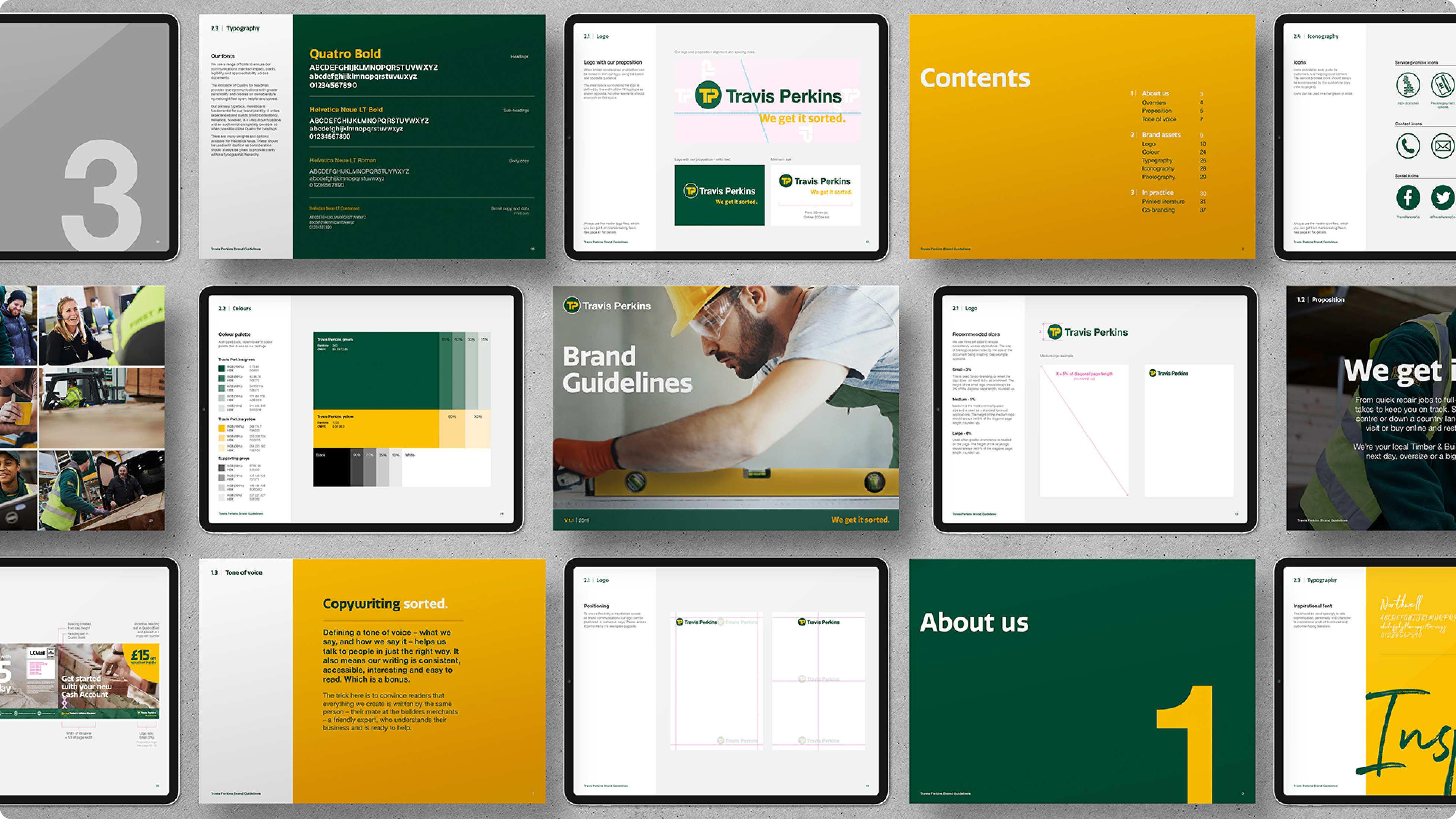
The Travis Perkins Case Study:
Now, let me give you a taste of the real-world impact of killer brand guidelines. Let’s dive into a case study featuring Travis Perkins, a top-notch builder’s merchant in the UK. Travis Perkins knew that crystal-clear and comprehensive brand guidelines were the name of the game to keep things consistent across their sprawling network of branches and outlets. By embracing robust digital brand guidelines, they made sure every branch had instant access to the latest brand assets and guidelines.
And what happened next? Well, they achieved a unified brand identity across every Travis Perkins location, boosting brand recognition and solidifying customer trust. Whether you walked into a Travis Perkins branch in London or Edinburgh, you were greeted with the same branding elements, reinforcing the company’s reputation for reliability and quality.
In conclusion, brand guidelines are the way forward. They’re easy to update, offer instant asset downloads, provide convenient access to team members and collaborators, and bid farewell to version confusion.
Need help with brand guidelines?
And if you’ve got questions or need a hand crafting your brand guidelines, don’t be shy – reach out to us at studio@madebymass.co.uk We’re here to help you achieve brand consistency and success, just like we did for Travis Perkins.
More insights


Call us
+44 (0)77 21113 538
Write to us
studio@madebymass.co.uk
© 2023 by Made by Mass Ltd
Privacy policy
© 2023 by Made by Mass Ltd
